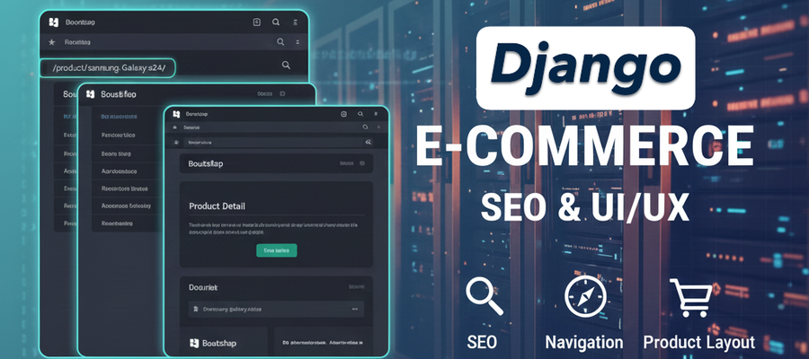
Mastering Django: SEO-Friendly URLs, Bootstrap Navigation, and Professional Product Layouts
Building a functional web application is one step, but transforming it into a professional-grade e-commerce platform requires attention to detail—specifically in SEO optimization, user navigation, and responsive design.
In this guide, we’ll walk through the process of upgrading a Django project by implementing Slug-based URLs, integrating a Bootstrap Navbar, and crafting a high-conversion Product Detail page.
Step1. Advanced URL Routing: The Power of Slugs
While using a product’s primary key (ID) in a URL is easy, it isn't ideal for Search Engine Optimization (SEO). A URL like /product/5/ tells a search engine nothing, whereas /product/samsung-galaxy-s24/ provides immediate context.
The Model Update
To transition to slug-based routing, we first update our models.py. We use Django's slugify utility to automatically generate these strings from the product name.
To handle a unique field constraint for a slug field in an existing Django project, follow these systematic steps as outlined in the tutorial:
1. Initial Field Setup with Null Allowance
When adding a unique slug field to a database that already contains records, you cannot immediately enforce a unique=True constraint because existing rows would have empty (null) values, violating the uniqueness.
- Define the slug field in your models.py with null=True and blank=True.
- Set a suitable max_length, such as 200 characters.
#products/models.py
slug = models.SlugField(max_length=200, null=True, blank=True)2. Automate Slug Generation
To ensure every product gets a slug derived from its name, override the model's save method.
- Import the slugify utility: from django.utils.text import slugify.
- Override the save method to check if the slug field is empty.
- If empty, populate it using slugify(self.name).
- Call the parent class's save method using super().save(*args, **kwargs).
#products/models.py

from django.utils.text import slugify
from django.db import models

class Product(models.Model):
    name = models.CharField(max_length=200)
    slug = models.SlugField(max_length=200, null=True, blank=True)

    def save(self, *args, **kwargs):
        if not self.slug:
            self.slug = slugify(self.name)
super().save(*args, **kwargs)3. Apply Initial Migrations
- Run python manage.py makemigrations to create the migration file with the nullable slug field.
- Run python manage.py migrate to apply these changes to the database.
4. Populate Existing Data
Before enforcing uniqueness, every existing record must have a unique value in the slug column.
- Navigate to the Django Admin panel.
- Open and save each existing record; the overridden save method will automatically generate and store the slug.
- Alternatively, you can manually enter custom slug strings for specific records. (Product Name: 'Premium Coffee Mug', Custom Slug: premium-mug), (Product Name: 'Yoga Mat Pro Series', Custom Slug: yoga-mat-pro")
- Populate slugs for existing records by Django Shell.
- Open Django shell: py manage.py shell.
- Execute the following code in the Django shell to populate the unique slug field for our URLs:
from products.models import Product
from django.utils.text import slugify

for product in Product.objects.all():
    if not product.slug:
        base_slug = slugify(product.name)
        slug = base_slug
        counter = 1
        # ensure uniqueness
        while Product.objects.filter(slug=slug).exists():
            slug = f"{base_slug}-{counter}"
            counter += 1
        product.slug = slug
product.save()5. Enforce the Unique Constraint
Once all records have populated slug values, you can finalize the database schema.
- Update models.py by removing null=True and adding unique=True.
#products/models.py

from django.utils.text import slugify
from django.db import models

class Product(models.Model):
    name = models.CharField(max_length=200)
    slug = models.SlugField(max_length=200, unique=True, blank=True)
    #...... Other codes.......

    def save(self, *args, **kwargs):
        if not self.slug:
            self.slug = slugify(self.name)
super().save(*args, **kwargs)- Run the migration commands again.
- If prompted for a default value during migration, you can select the option to skip or provide a temporary one, as you have already manually filled the data.
Updating the Routing and View
In urls.py, we swap the integer converter for a slug converter:
- Old: path('product/<int:pk>/', views.product_detail, name='product_detail')
- New: path('product/<slug:slug>/', views.product_detail_slug, name='product_detail_slug')
In views.py, the query changes from pk to slug:
def product_detail_slug(request, slug):
    product = get_object_or_404(Product, slug=slug)
return render(request, 'product_detail.html', {'product': product})Step2. Implementing a Global Navigation Bar
A professional site needs consistent navigation. Instead of hard-coding a menu on every page, we create a modular navbar.html component and include it in our base.html.
The Navbar Component
Using Bootstrap, we can quickly deploy a mobile-responsive, dark-themed menu:
#templates/navbar.html

<nav class="navbar navbar-expand-lg bg-dark navbar-dark">
    <div class="container-fluid">
        <a class="navbar-brand" href="{% url 'product_list' %}">Myshop</a>
        <button class="navbar-toggler" type="button" data-bs-toggle="collapse" data-bs-target="#navbarSupportedContent"
            aria-controls="navbarSupportedContent" aria-expanded="false" aria-label="Toggle navigation">
            <span class="navbar-toggler-icon"></span>
        </button>
        <div class="collapse navbar-collapse" id="navbarSupportedContent">
            <ul class="navbar-nav me-auto mb-2 mb-lg-0">
                <li class="nav-item">
                    <a class="nav-link active" aria-current="page" href="{% url 'product_list' %}">Products</a>
                </li>
                <li class="nav-item">
                    <a class="nav-link" href="#">Link</a>
                </li>
                <li class="nav-item dropdown">
                    <a class="nav-link dropdown-toggle" href="#" role="button" data-bs-toggle="dropdown"
                        aria-expanded="false">
                        Dropdown
                    </a>
                    <ul class="dropdown-menu">
                        <li><a class="dropdown-item" href="#">Action</a></li>
                        <li><a class="dropdown-item" href="#">Another action</a></li>
                        <li>
                            <hr class="dropdown-divider">
                        </li>
                        <li><a class="dropdown-item" href="#">Something else here</a></li>
                    </ul>
                </li>
                <li class="nav-item">
                    <a class="nav-link disabled" aria-disabled="true">Disabled</a>
                </li>
            </ul>
            <form class="d-flex" role="search">
                <input class="form-control me-2" type="search" placeholder="Search" aria-label="Search" />
                <button class="btn btn-outline-success" type="submit">Search</button>
            </form>
        </div>
    </div>
</nav>Global Integration
By using the {% include %} tag in your base template, the navbar appears across the entire site instantly.
#templates/base.html

<!-- other codes -->
<body>
    {% include 'navbar.html' %} <!-- Add this line -->
    <!-- other codes -->
</body>Step3. Designing a Professional Product Detail Page
A product page needs to be clean, informative, and urgent. We utilize the Bootstrap Grid System to create a 50/50 split between the product imagery and the purchasing details.
Key UI Features:
- Responsive Imagery: Using the .img-fluid class ensures the product photo scales perfectly from desktop to mobile.
- Dynamic Stock Status: We use Django logic to visually alert the user if an item is available.
- Clear Call to Action (CTA): A large, primary-colored "Add to Cart" button draws the eye immediately.
#templates/products/product_detail.html

{% extends "base.html" %}
{% block title %} Product {% endblock %}
{% block content %}
<!-- <h1>{{ product.name }}</h1>
<p>price - rs {{ product.price }}</p>
<p>Description - {{ product.decsription }}</p>
<p>Stock - {{ product.stock }}</p> -->


<div class="container my-2">
    <a href="{% url 'product_list' %}">Go to Products</a>
    <div class="row">

        <!-- Product Image -->
        <div class="col-md-6">
            <img src="{{ product.image.url }}" class="img-fluid rounded shadow" alt="{{ product.name }}">
        </div>

        <!-- Product Info -->
        <div class="col-md-6">
            <h1>{{ product.name }}</h1>
            <h3 class="text-success">₹{{ product.price }}</h3>
            <p class="mt-2">
                <strong>Stock:</strong>
                {% if product.stock > 0 %}
                <span class="text-success">In Stock ({{ product.stock }})</span>
                {% else %}
                <span class="text-danger">Out of Stock</span>
                {% endif %}
            </p>
            <button class="btn btn-lg btn-primary mt-3">
                Add to cart
            </button>
        </div>

        <!-- Product Description -->
        <div class="col">
            <p class="mt-3 text-muted" style="font-size: 1.1rem;">
                {{ product.description }}
            </p>
        </div>

    </div>

</div>
{% endblock %}Step4. Why Responsiveness Matters
Bootstrap’s grid is based on 12 columns. By using classes like col-md-6, we tell the browser: "On medium and large screens, take up half the width. On mobile devices, stack vertically and take up the full width." This ensures your shop looks great whether your customer is on a smartphone or a 27-inch monitor.
Step5. Summary & Next Steps
We’ve successfully upgraded our Django application with:
- SEO-friendly Slugs for better search visibility.
- Modular Navbar for consistent site-wide navigation.
- Bootstrap Grid Layouts for a professional e-commerce feel.
Do You Need Side Hustle?
Get Paid to Share Your Opinion: User Interviews Can Get You Quick Cash
Ever heard of User Interviews? It's a platform that pays you for your feedback on products and services. The best part is that you can get a bonus just for signing up and completing your first study. I've already earned money with them, and you can, too.
Click here to sign up and get your bonus! Please wait until Sign Up page load.
Disclaimer: Referral bonus amounts are subject to change. The bonus is awarded after you complete your first paid study and may take a few days to process. All terms and conditions are set by User Interviews, and it's best to check their official site for the most up-to-date program rules.
Earn Cash for Your Opinions and a Bonus to Boot: Try Respondent.io
Respondent is a top platform that pays you for taking part in market research and user interviews. I've used it to find great paid studies, and you can, too. Their referral program is a fantastic way to earn more: when a friend you refer signs up and completes a study, you both get a bonus. It’s a great way to earn a little extra for yourself while helping a friend find paid work.
Click here to sign up and get your bonus!
Disclaimer: Referral bonus amounts and terms are subject to change by Respondent.io. The bonus is typically awarded after the referred friend completes their first paid study. Please check their official referral program page for the most up-to-date details.
Coming Up Next:
In the next segment, we will dive into User Authentication. We’ll learn how to build Sign-up and Login systems to allow customers to create accounts and track their orders.
Learn More